0

I have a dataframe that is divided into 27 clusters. in order to graph all these clusters in only a plot, I use the following for loop:

list_of_clusters= list(set(klabels))
    
fig=plt.figure(figsize=(13,9),frameon=True,facecolor='lightgrey', edgecolor='black')
    ax = fig.add_subplot(1,1,1)
    plt.axis()
    plt.xlim([-2.5, 0.2])
    plt.ylim([-0.7, 3.3])
    plt.xlabel("log PhiZ")
    plt.ylabel("log RQI")
    
    for i in list_of_clusters:
        
        plt.scatter(
        logphizlogrqi[klabels == i, 0], logphizlogrqi[klabels == i, 1],
        s=10, cmap='hsv',
        marker='8',
        label=i+1
        )


    ax.yaxis.tick_right()
    ax.yaxis.set_ticks_position('both')
    plt.legend(scatterpoints=1, loc='center left',bbox_to_anchor=(-0.4, 0.5))
    plt.grid()
    plt.show()

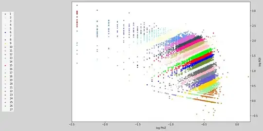
but the resulting graph uses each color more than once as you can see in the plot below:

Ideally, the graph I'm looking for should look like the following (although the colors are close to each other, they are used only once):

I'd really appreciate it if you could help me fixing my problem

  • You can look at some of existing [colormaps](https://matplotlib.org/3.3.2/tutorials/colors/colormaps.html) and see if any of them work in your case. – hilberts_drinking_problem Oct 24 '20 at 06:51
  • @hilberts_drinking_problem I have. all of them result in the same plot. I've tried Qualitative, Miscellaneous, Diverging etc. but non of them worked. – Alirezaro93 Oct 24 '20 at 07:02
  • [https://stackoverflow.com/questions/8389636/creating-over-20-unique-legend-colors-using-matplotlib/44937195#44937195](https://stackoverflow.com/questions/8389636/creating-over-20-unique-legend-colors-using-matplotlib/44937195#44937195)I find this answer to be very helpful – r-beginners Oct 24 '20 at 07:16
  • @r-beginners does not work unfortunately. i receive the following error: (AttributeError: 'AxesSubplot' object has no attribute 'set_color') .the other answers fail to work as well – Alirezaro93 Oct 24 '20 at 08:16
  • I usually use something [like this solution](https://stackoverflow.com/a/25730396/8881141) with a non-repetitive colormap. But in general, 27 unique colors that are easily distinguishable is ambitious. – Mr. T Oct 24 '20 at 09:36

2 Answers2

1

Please add and fix the following code in the example of seaborn in response to a comment.

Add.

import seaborn as sns

NUM_COLORS = 27

sns.reset_orig() 
colors = sns.color_palette('husl', n_colors=NUM_COLORS)

editing

for i in list_of_clusters:
    plt.scatter(
    logphizlogrqi[klabels == i, 0], logphizlogrqi[klabels == i, 1],
    s=10, cmap='hsv',
    marker='8',
    label=i+1,
    color=colors[i] # update
    )

enter image description here

r-beginners
  • 31,170
  • 3
  • 14
  • 32
0

so I came up with this method and it worked fine:

from matplotlib import colors as mcolors
import random

list_of_clusters= list(set(klabels))

colors = list(mcolors.CSS4_COLORS.keys())
random.shuffle(colors)

fig=plt.figure(figsize=(13,9),frameon=True,facecolor='lightgrey', edgecolor='black')
ax = fig.add_subplot(1,1,1)
plt.axis()
plt.xlim([-2.5, 0.2])
plt.ylim([-0.7, 3.3])
plt.xlabel("log PhiZ")
plt.ylabel("log RQI")

for i in list_of_clusters:
    plt.scatter(
    logphizlogrqi[klabels == i, 0], logphizlogrqi[klabels == i, 1],
    s=10,
    marker='8',
    label=i+1,
    color=colors[i]
    )

ax.yaxis.tick_right()
ax.yaxis.set_label_position('right')
ax.yaxis.set_ticks_position('right')
plt.legend(scatterpoints=1, loc='center left',bbox_to_anchor=(-0.4, 0.5))
plt.show()

The result looks like below: