0

I am trying to make a business card with name and title in the center and email and phone to be on extreme left and right on the card

Here is my following code

.business-card{
   position:relative;
   border:1px solid black;
  width:200px;
}
.business-card section {
  display:flex;
  flex-flow:column;
  align-items:center;
}


.email{
  position:absolute;
  right:0;
}
<div class="business-card">
  <section>
      <span>
          name:abc
    </span>
    <span>
        title:xyz
    </span>
  </section>
 <footer>
   <span class="phone">
       123-123-123
   </span>
     <span class="email">
       abc@abc.com
   </span>
  </footer>
</div>
 
I am trying to get the name/title wrapped but it extends out of the div.

.business-card{
   position:relative;
   border:1px solid black;
  width:200px;
}
.business-card section {
  display:flex;
  flex-flow:column;
  align-items:center;
  
}


.email{
  position:absolute;
  right:0;
}
<div class="business-card">
  <section>
      <span>
          name:abcsfsdfjsdflkjsdjflssfsdfds
    </span>
    <span>
        title:xyz
    </span>
  </section>
 <footer>
   <span class="phone">
       123-123-123
   </span>
     <span class="email">
       abc@abc.com
   </span>
  </footer>
</div>
 

Can some one please help on this PS:Attached is the sample screen shot of the business card im looking to develop
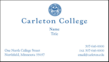
enter image description here

Geeky
  • 7,420
  • 2
  • 24
  • 50

4 Answers4

1

.card {
  border: 1px solid lightgray;
}
.title {
  display: flex;
  flex-direction: column;
  padding: 1em;
  align-items: center;
  text-align: center;
  word-break: break-all;
}
.title > div {
  width: 50%;
}
.info {
  display: flex;
  padding: 2em;
}
.info > div {
  flex: 1;
}
.info > div:nth-child(2) {
  text-align: right;
}
<div class="card">
  <div class="title">
    <div>Name: eDesignary</div>
    <div>Title: Source code platform!</div>
  </div>
  <div class="info">
    <div>Hyderabad</div>
    <div>edesignary@gmail.com</div>
  </div>
</div>

Please let me know if your problem is solved.

Naresh
  • 862
  • 3
  • 12
  • 35
  • 1
    ..I am looking for something exactly this but even with your code if i try to add extra text within the section of text name and title it is coming out of the div ,instead i want it to get wrapped within the div...please help – Geeky Oct 14 '16 at 20:48
  • Thanks for the response...now it is working correctly. Another question, i tried to give width to title(as of now it is taking the full-width), it takes the width but does the content does not seem to be center – Geeky Oct 14 '16 at 21:59
0

Get a codepen.io account > search "business card" and then create something similar based off another person's pen. You can learn this way about other methods you wouldn't normally know about.

As for this, I'd probably make a DIV of something like 500px

The picture would take 50% of the div's heigh Then format your text accordingly

MercPls
  • 128
  • 8
  • Here is my codepen reference for the business card http://codepen.io/sahithiK/pen/bwWKyr...any help would be much appreciated – Geeky Oct 14 '16 at 19:59
  • If i try to remove the image and add some text in that place and add more content to it, it is not getting wrapped, it is coming out of the div. – Geeky Oct 14 '16 at 20:49
0

When we type names, we put spaces between first, middle and last names. Assuming that none of these is very long, we can make your code work simply by swapping 'align-items' with 'text-align'.

HTML:

 <div class="business-card">
  <section>
    <span>
          name:abcsfs dfjsd     flkjsdj flssfsdfds
    </span>
    <span>
        title:xyz xyz xyz xyz xy xyz xyz xyz xyz
    </span>
  </section>
  <footer>
    <span class="phone">
       123-123-123
   </span>
    <span class="email">
       abc@abc.com
   </span>
  </footer>
</div>

CSS:

 .business-card {
  position: relative;
  border: 1px solid black;
  width: 200px;
}

.business-card section {
  display: flex;
  flex-flow: column;
  text-align: center;
}

.email {
  position: absolute;
  right: 0;
}

Please let me know if this solves your problem.

S. Rahman
  • 11
  • 2
0

Check Below snippet... let me know

.business-card{
   position:relative;
   border:1px solid black;
  width:800px;
  height: 400px;
}
.business-card section {
  display:flex; 
  flex-flow:column;
  align-items:center;
}
.email{
  position:absolute;
  right:0;
}

#textbox p{
  display: inline-block;
  width:31%!important;
  vertical-align:top;
  text-align:left;
  padding:0px 5px;
}
<div class="business-card">
  
  <section>
      <span>
          <img style="height: 200px; width: 400px; align-items:center;" src="http://www.underconsideration.com/brandnew/archives/google_2015_logo_detail.png"/>
    </span>
  </section>
  
  <div id="textbox">
  
  <p>Text on the left.Text on the leftText on the leftText on the leftText on the leftText on the leftText on the leftText on the leftText on the leftText on the leftText on the leftText on the leftText on the leftText on the leftText on the leftText on the leftText on the leftText on the left</p>
    <p>Text on the middle.Text on the middle.Text on the middle.Text on the middle.Text on the middle.Text on the middle.Text on the middle.Text on the middle.Text on the middle.Text on the middle.Text on the middle.Text on the middle.</p>
  <p>Text on the right.</p>
  </div>
  <br>
  <br>
  
  <div style="clear: both;"></div><!-- Fixes float issues -->
  
</div>
 
srinivas.ln
  • 309
  • 2
  • 6